Salvador Dalí was the graphic designer behind the classic Chupa Chups logo.
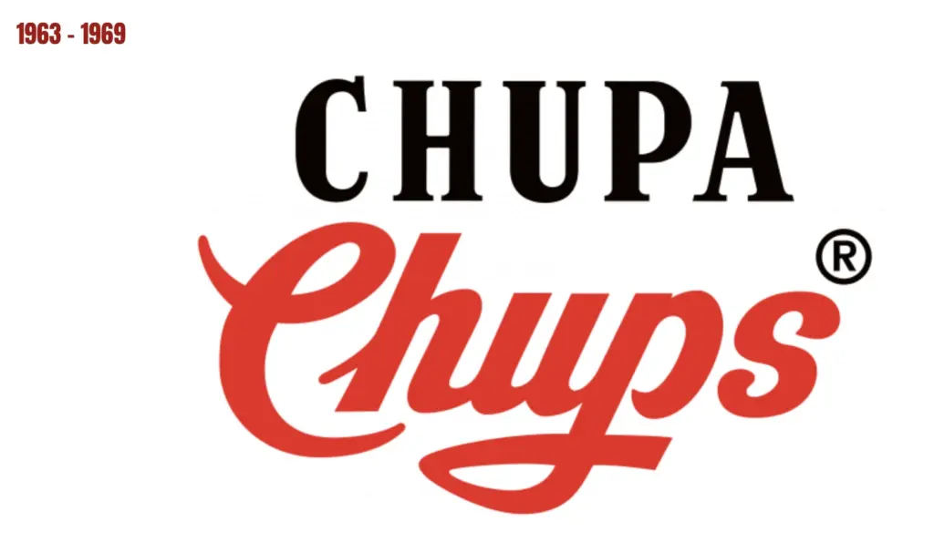
The Chupa Chups lollipop was first launched in 1958, when the company founder Enric Bernat hatched the idea of placing a bonbon on a stick. He called the product “GOL,” but that didn’t work too well. So, he hired an ad agency in 1963. They renamed the product “Chupa Chups” (from the Spanish chupar, meaning “to suck”) and created a black and red logo.

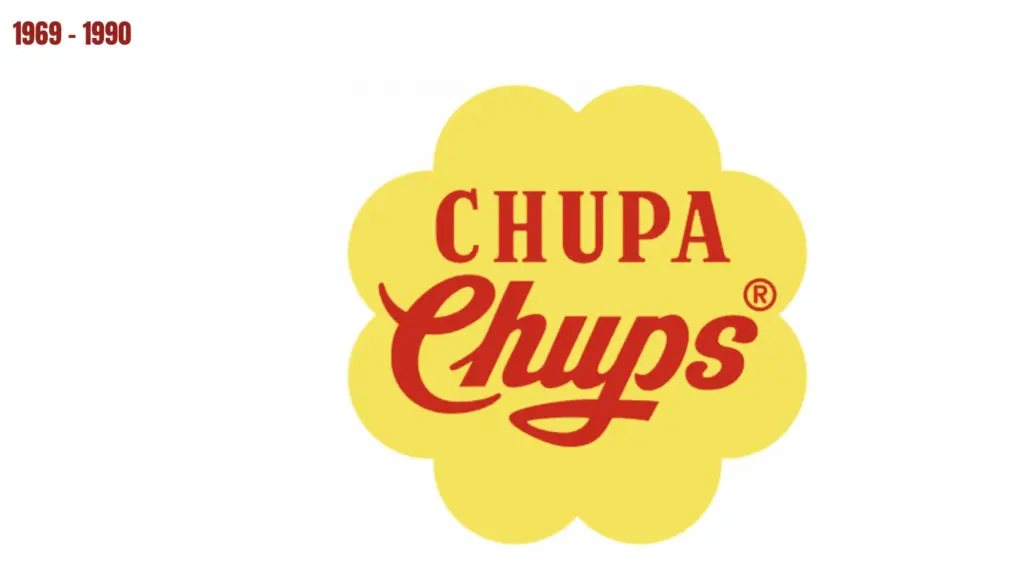
But Bernat wasn’t happy with the logo. In 1969, he complained about his logo over a coffee with his artist friend, Salvador Dalí. The painter went to work, doodling for an hour on newspapers that were laying around. Yep, that’s right, apparently it took him less than an hour to create one of the most iconic logos of all time.
Pop the Chupa Chups name inside a daisy flower.
Dali’s solution was to put the brand name inside a daisy flower. He changed both parts of the logotype to red shade and placed it on a solid yellow background. The flower is a clever nod to the traditional Spanish children’s song “Debajo de un botón,” which mentions a daisy. The combination of red and yellow perfectly represents the essence and purpose of the brand and makes the lollipops stand out on counters and shelves all over the globe.
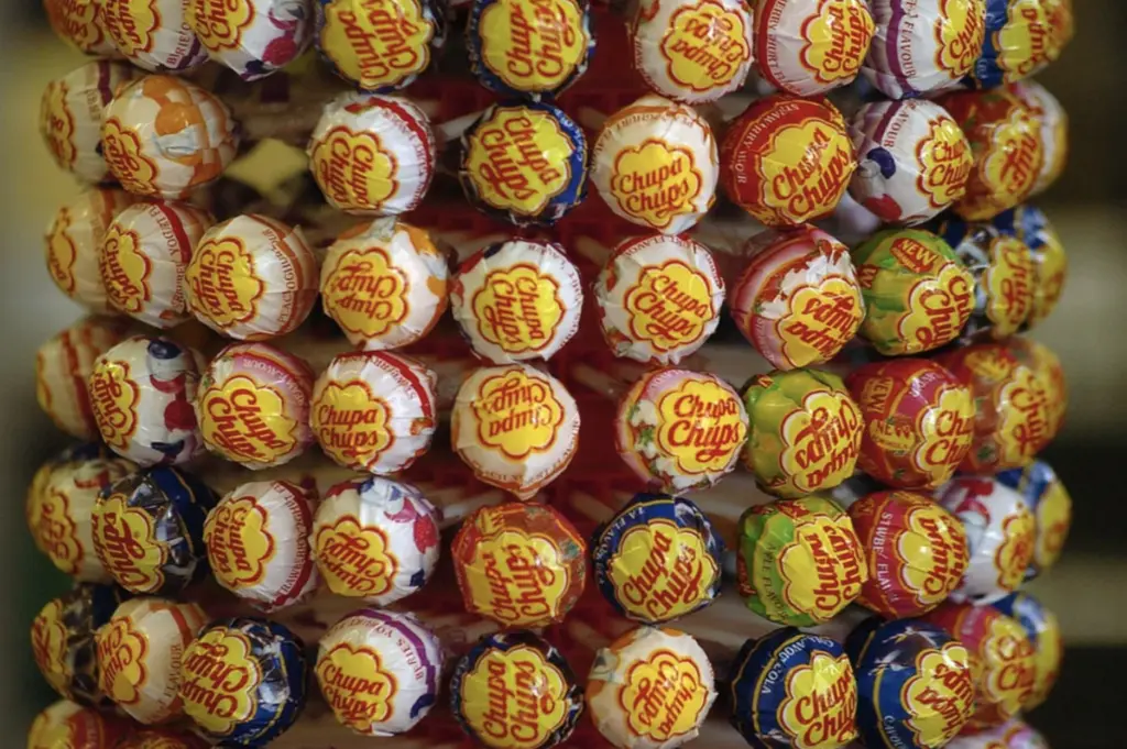
One of the most notable aspects of Dali’s design is its strategic placement on the lollipop wrappers. Dali insisted that the logo be displayed on top of the lollipop, making it visible even when the candy was being enjoyed. This was a revolutionary concept at the time, as most candy logos were hidden beneath the wrapper on the inside. By positioning the logo front and center, Dali made sure that Chupa Chups would be instantly recognisable and unforgettable.

Lesson to all: stick with what works.
In 2018 the brand turned 60 years old in top shape, being one of the best-selling products in the world. It’s estimated that its daily production is 12 million units that reach 150 countries in more than 100 different flavours.
The Chupa Chups logo serves as a reminder of the importance of branding and the potential for art to transcend its traditional boundaries. It’s very cool to think that one of the greatest artists of the 20th century was also responsible for the visual identity of a candy brand.
The Chupa Chups logo has stood the test of time, proving that it’s important to stick with what works. Modern trends can be fleeting or misaligned with your brand. Be sure to consistently stay true to your brand’s core values and identity.


