The design of the Nike logo cost $35.
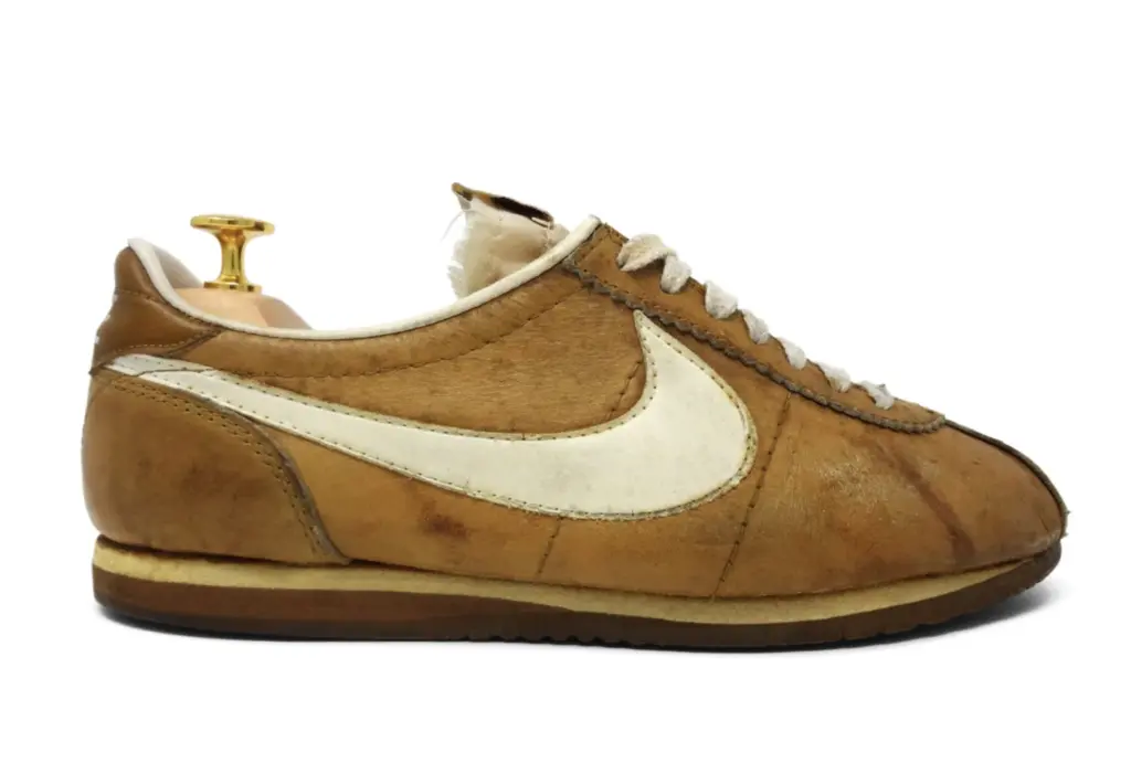
The Nike logo was designed by graphic designer Carolyn Davidson in 1971. Originally named Blue Ribbon Sports, Phil Knight’s newly named Nike needed an official mark. So, Knight turned to a graphic design student, Carolyn Davidson, to create a logo for a brand named after the Greek goddess of victory. Her brief was simple yet challenging: create a logo that conveyed a sense of movement.
Earning $2 per hour, Carolyn Davidson spent 17.5 hours working on the project. She was inspired by the flight and wingspan of the Greek goddess of victory, Nike. The logo she created depicts motion, speed, and success (in the form of a positive checkmark). Her invoice total for this iconic piece of branding and design history? $35.

“I don’t love it, but maybe it will grow on me.”
The process of getting the logo approved was not a simple one. Knight was not easy to please. Carolyn worked hard and proposed multiple designs, but none got Knight’s approval.
Many of us know this is routine procedure with clients. It happened with some of the most famous logos in the history of design, like the MTV logo. Eventually, Knight chose the checkmark design saying, “I don’t love it, but maybe it will grow on me”, as Nike’s official story tells.
He didn’t love it, but he didn’t reject it either. And that’s because Phil Knight thought it had potential: there might be a kernel of something brilliant in it. The logo became the official mark of Nike via the US Patent Office on June 18, 1971.
Feel the fear and just do it.
The Nike logo story shows us how new things scare us. Our natural reaction when we see something new, different, or creative is to run a mile. I’ve witnessed this happen in many design and creative presentations.
The next time you see a new idea and it scares you a bit, try it on. See if it fits. And maybe it will grow on you. When you hear a suggestion from someone that’s different from what you’ve done before, don’t shut it down – embrace it. Because that scary feeling you’re feeling could be a sign that you’re onto something potentially brilliant.
Phil Knight knew that what mattered more than anything was building recognisability and distinctiveness, and doing everything you can to imbue your brand with meaning. I think it’s why we now look back and see the logo and tagline as so iconic.
PS Phil Knight did give Carolyn Davidson 500 shares of Nike stock a decade later: which were valued at an estimated $1,000,000 in 2015.